NWO Junior Roller Derby’s previous branding did not effectively reflect its core values of inclusivity and community, limiting its ability to connect with participants and supporters.
Solution
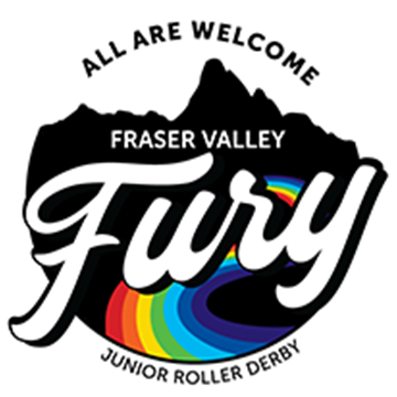
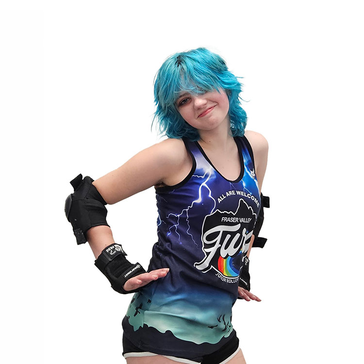
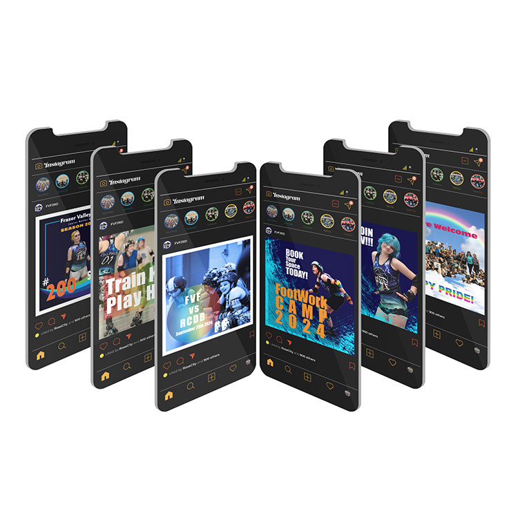
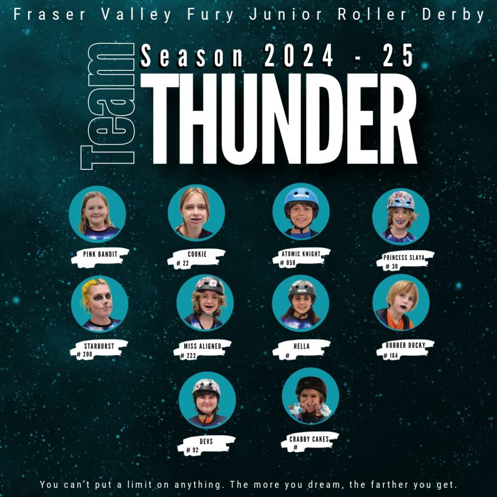
The league underwent a rebranding, emerging as Fraser Valley Fury Junior Roller Derby with the tagline “All are Welcome.” A new logo, inspired by the Fraser Valley’s rainbow colors, rivers, and mountains, emphasized diversity, unity, and regional pride.
Outcome
The rebranding aligned the league’s identity with its values, fostering a stronger sense of belonging and acceptance. This transformation created a more welcoming environment, enhancing engagement and support within the community.
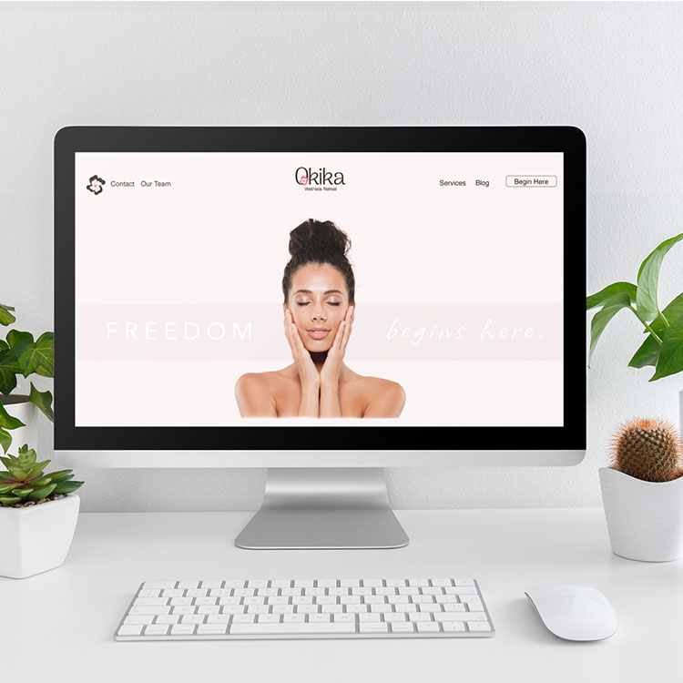
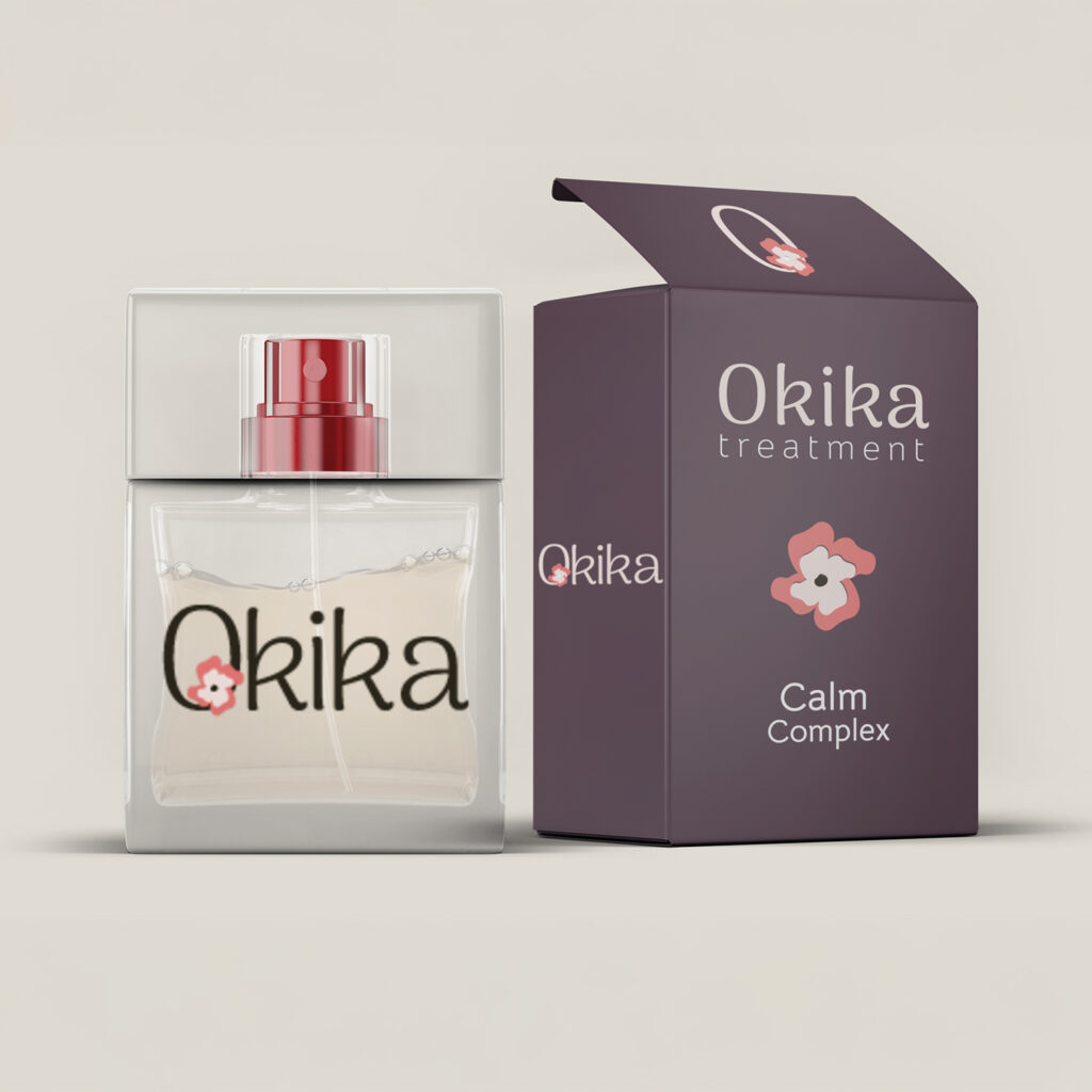
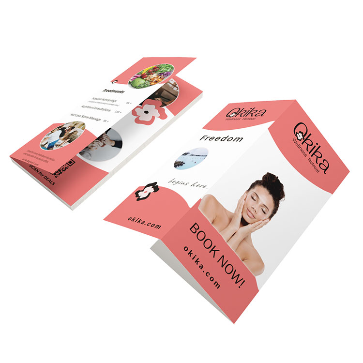
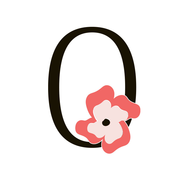
Okika Wellness Retreat
Empowering Healing Through Thoughtful Designs
Okika Wellness Retreat – Brand Identity – Concept
Problem
Okika Wellness Retreat in Hawaii struggled with an outdated brand identity and lacked effective tools to communicate its holistic approach to healing unresolved trauma, anxiety, and stress.
Solution
We developed a cohesive rebrand inspired by Hawaii’s natural beauty, creating a tranquil logo, merchandise, and brochures that highlighted Okika’s unique offerings, including trauma-informed therapy, therapeutic yoga, and saltwater therapy.
Outcome
The rebranding elevated Okika’s visibility, expanded its audience, and strengthened community connections. Participants reported improved emotional well-being, finding healing and harmony in a nurturing environment, while the retreat solidified its position as a sanctuary for transformative wellness.
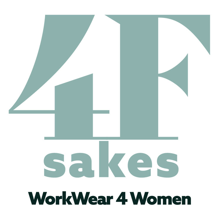
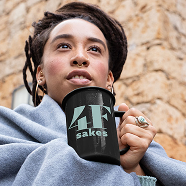
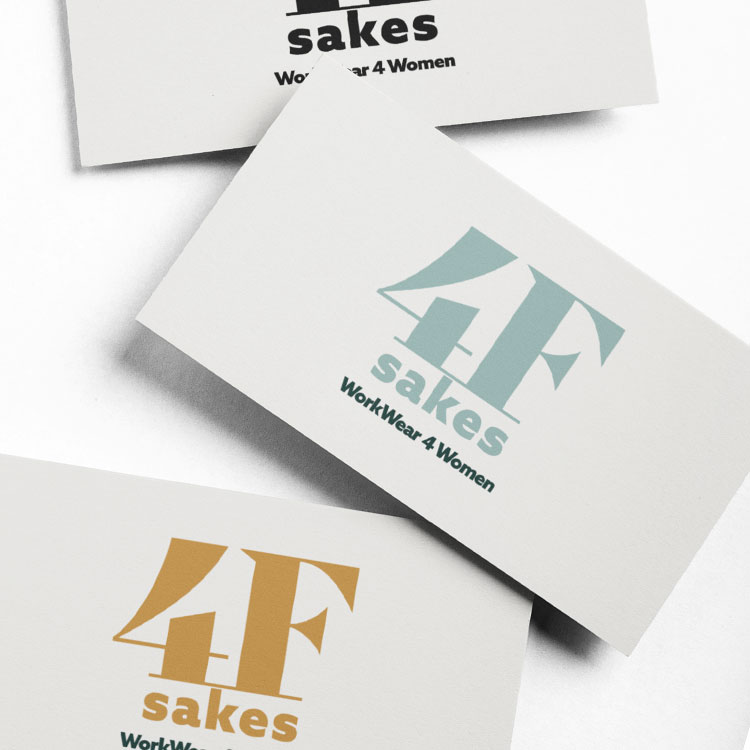
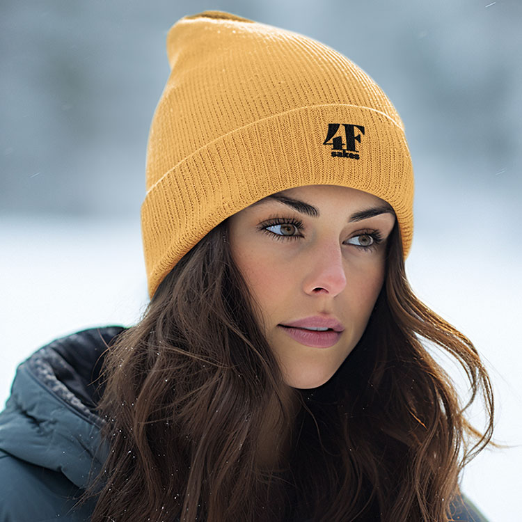
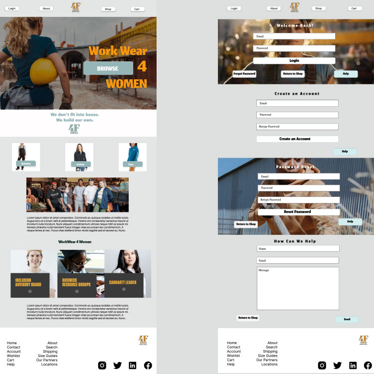
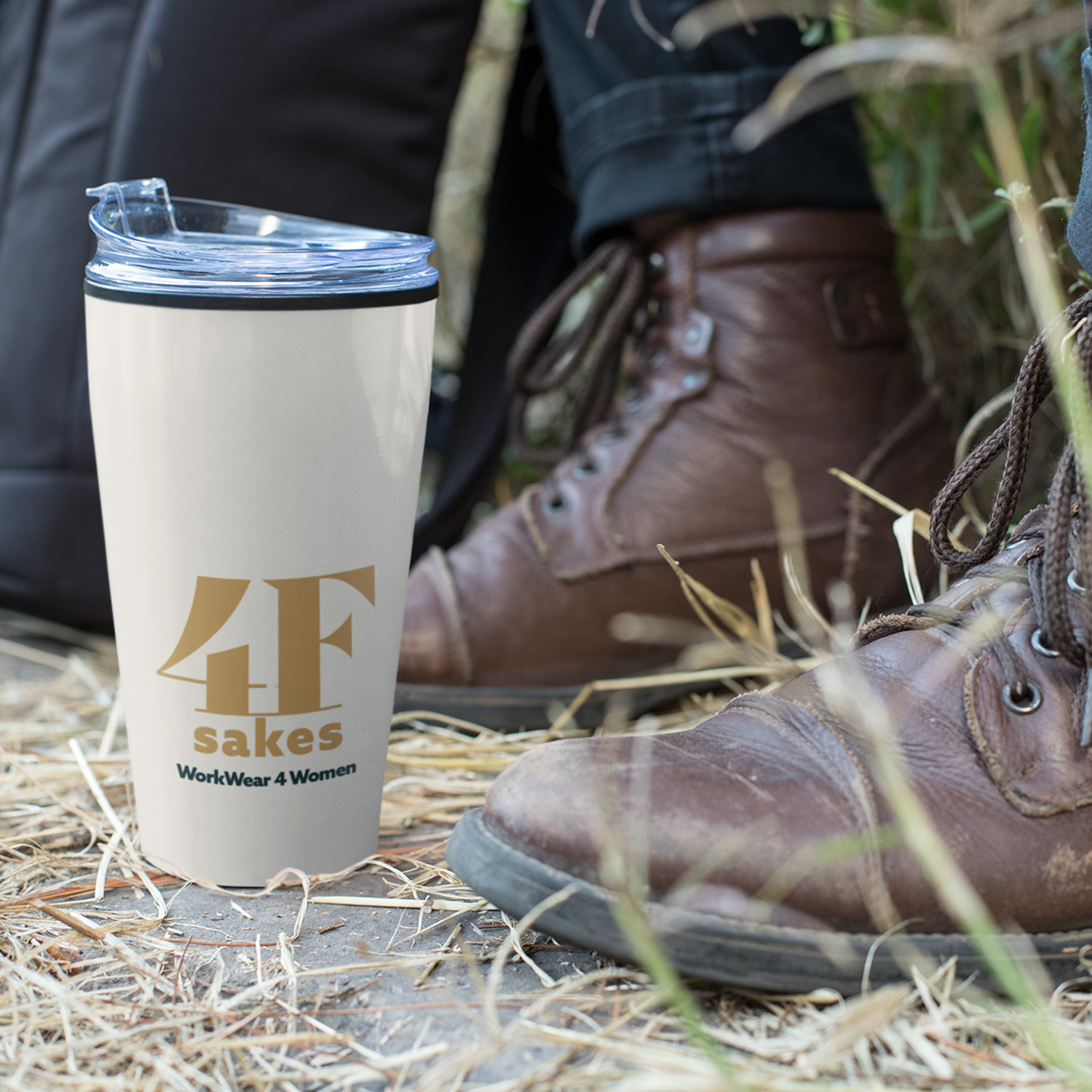
4F Sakes WorkWear for Women
We don’t live in boxes we build them.
4F Sakes WorkWear for Women by Women – Brand Identity – Concept
Problem
Women in the workforce faced a lack of accessible, well-designed workwear, often forced to choose ill-fitting and uninspiring options from the men’s section, impacting comfort, confidence, safety, and productivity.
Solution
4F Sakes WorkWear revolutionized women’s work attire by designing durable, functional, and stylish options tailored specifically for women. With the empowering slogan “We don’t fit into boxes, we build them 4F sakes,” the brand prioritized fit, form, and functionality while ensuring accessibility and style.
Outcome
4F Sakes WorkWear filled a critical gap in the market, empowering women with comfortable, safe, and stylish workwear. Its innovative approach and commitment to quality established the brand as a leader in women’s workwear, resonating with hard-working women across industries.
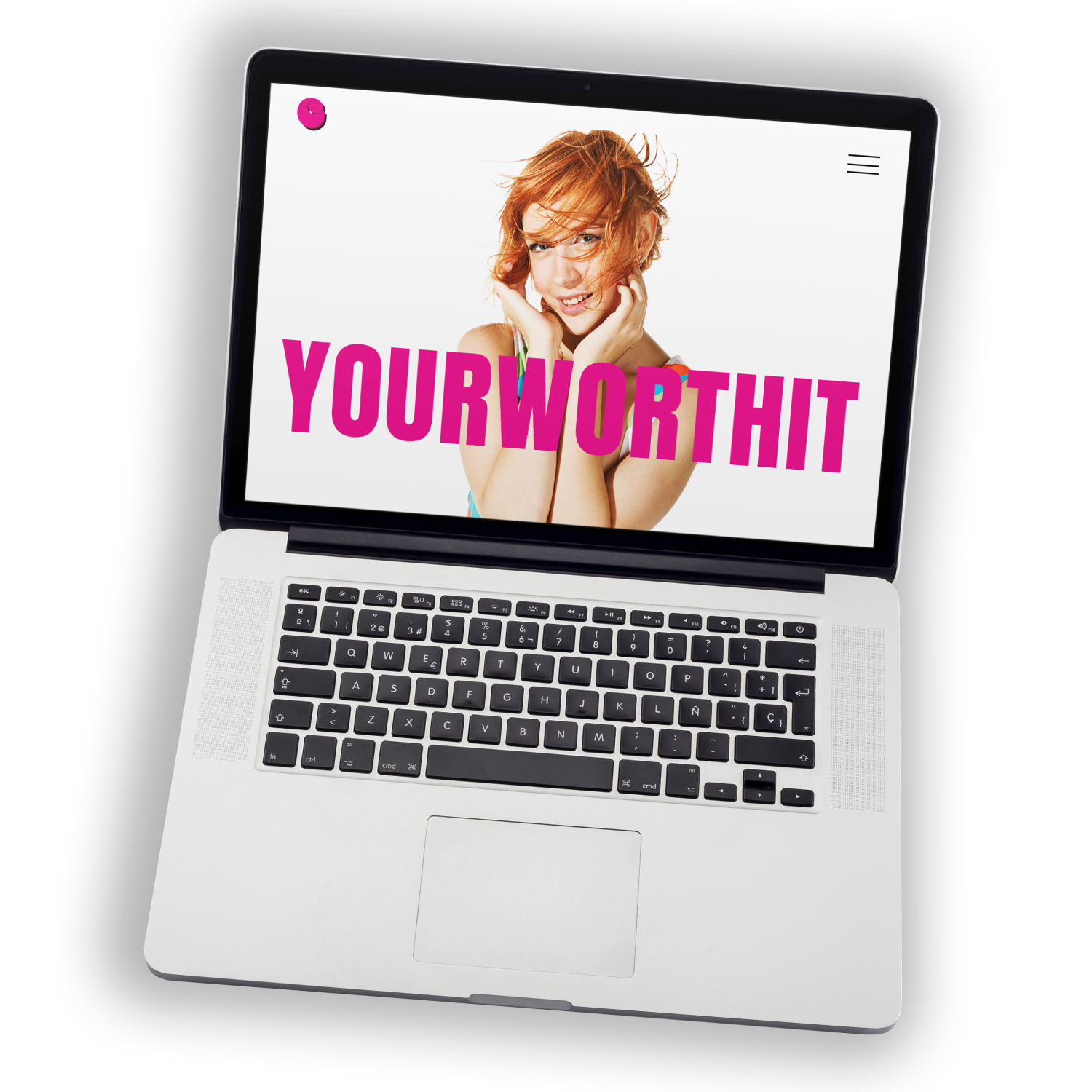
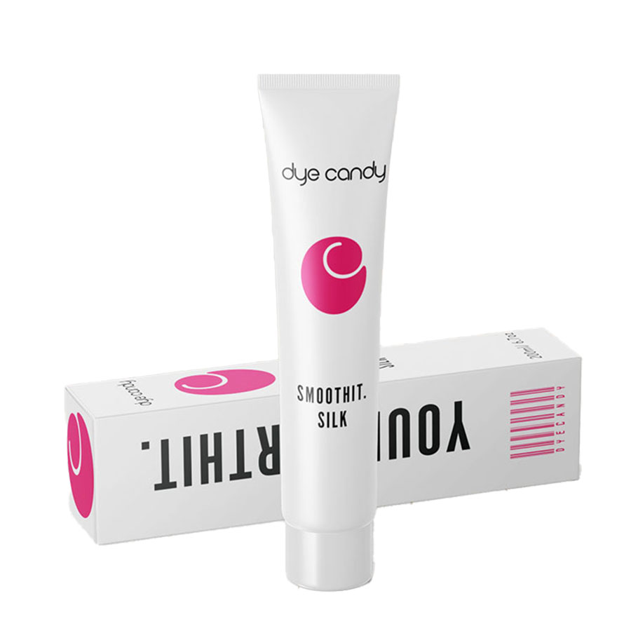
Dye Candy Hair Studio
YOURWORTHIT.
Dye Candy Hair Studio – Rebrand – Concept
Problem
Dye Candy Hair Salon struggled with an outdated brand identity and a limited customer base, hindering its ability to attract a broader, more diverse clientele.
Solution
We developed a sophisticated rebrand featuring a new logo, cohesive visual identity, and a line of elegantly packaged hair care products. A targeted social media strategy highlighted inclusivity and upscale services, amplifying the salon’s reach.s, amplifying the salon’s reach.
Outcome
The rebranding expanded the salon’s clientele, increased revenue through product sales, and established Dye Candy as a premier destination for hair care in Penticton, BC.
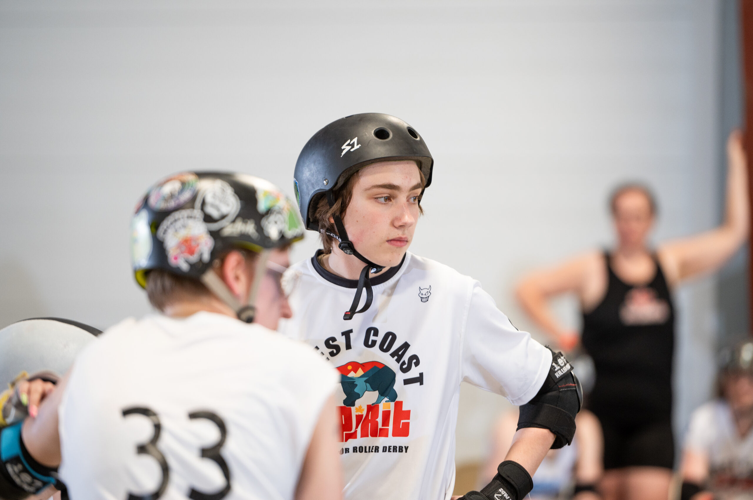
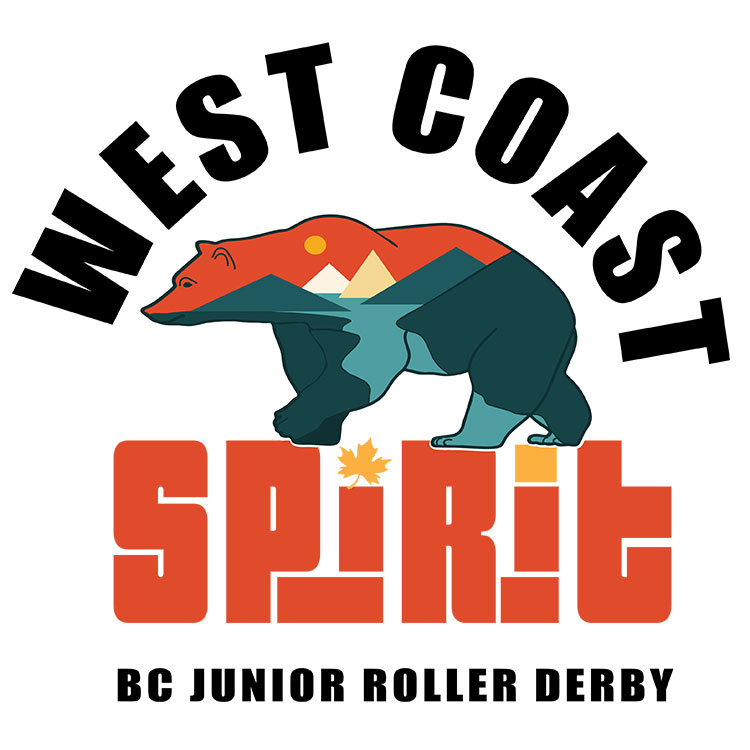
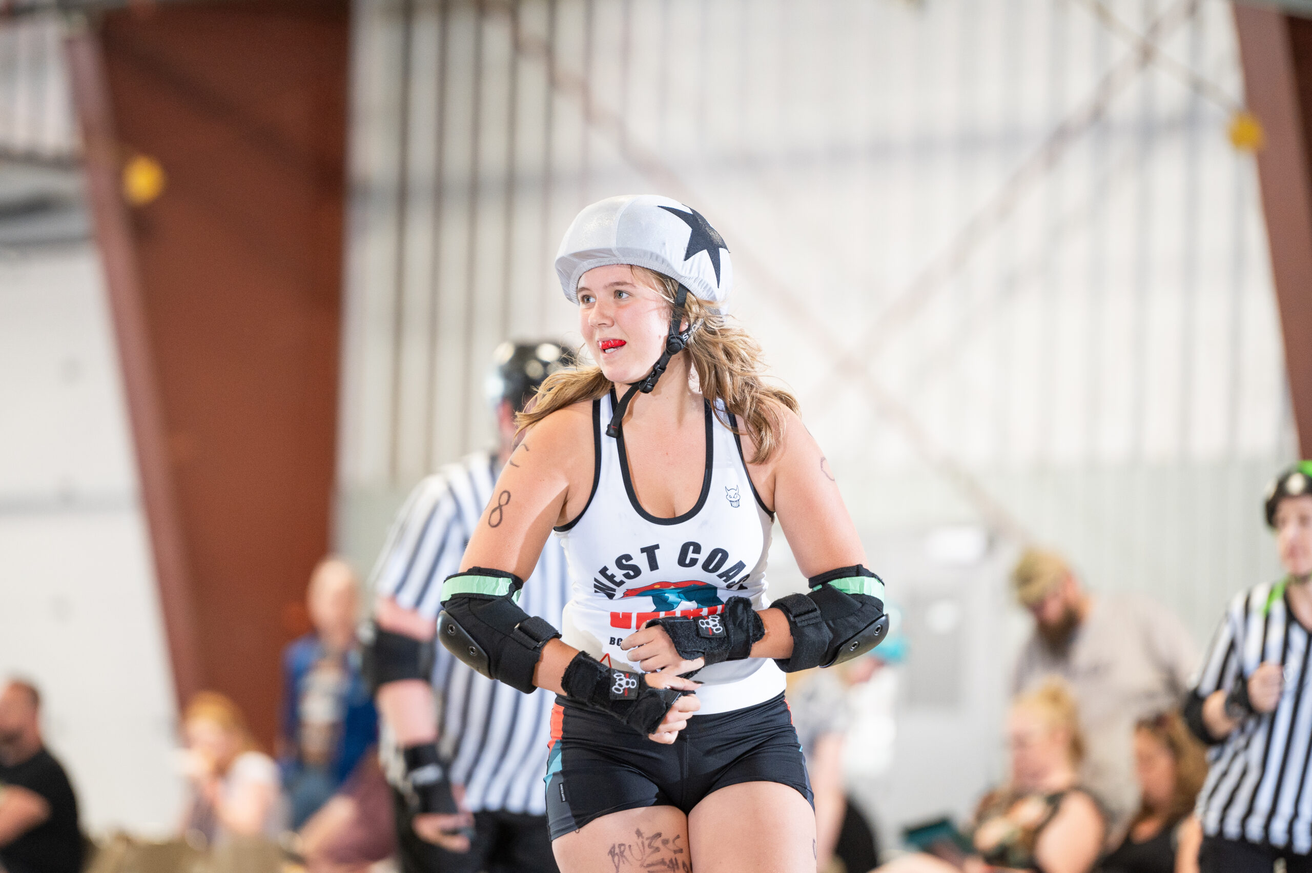
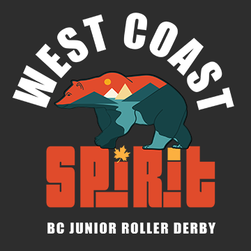
West Coast SPIRIT Junior Roller Derby
We skate for inclusivity and empowerment
West Coast Spirit Junior Roller Derby – Brand Identity
Photo Credit Lydia Brewer
Problem
The league’s previous branding failed to reflect its mission of inclusivity and empowerment, limiting its ability to connect with its community and represent British Columbia’s skaters effectively.
Solution
We created a new logo featuring a confident bear and BC’s natural elements, symbolizing strength and unity. The slogan, “We skate for inclusivity and empowerment,” reinforced the league’s welcoming and empowering ethos.
Outcome
The rebranding aligned the league’s identity with its values, fostering a stronger community connection and positioning West Coast SPIRIT as a leading force in roller derby across Canada and the US.